Blue is everywhere. It's the colour of the sky, the sea, lakes and oceans. We see it at the edge of a glacial ice flow or the vibrant shade of a robin's egg.
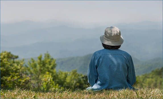
Our woodlands spring into early summer with carpets of bluebells, and we name some of our most treasured places with names such as the Blue Mountains of Australia, or the Blue Ridge Parkway of North Carolina – one of my favourite places to sit and knit.
It is no coincidence that the Japanese word for indigo blue, Ai, is also the word for love.
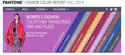
And it would be hard to imagine a Pantone colour forecast without some kind of blue in it. Who can forget the vibrant royal blue sweaters and dresses from the 1980's? They were everywhere. The same colour came back in a couple of years ago and had a brief flurry of interest, with cobalt skirts and jackets in the shops once again.
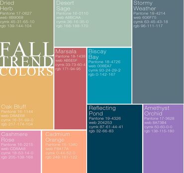
However, since then colours have toned down quite considerably. Here is the colour forecast for Fall/Winter 2015/2016 with the "Stormy Weather" colour I featured before. In this forecast collection the blue is now dark, reflective, almost retiring and sombre.
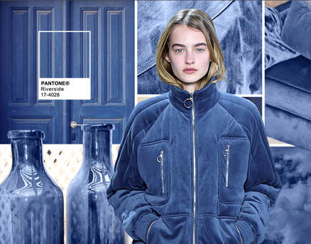
However, for Summer 2016, blue has become lighter again and is not just one of the colours in the palette – it is taking centre‐stage. Pantone speaks of "the desire for tranquility, strength and optimism" inspiring a colour palette led by blues.
They speak of a "cool and calming colour which maintains a sense of constancy”. And that seems to be the main theme for the coming season – cool, calm constant…
In my next blogpost I will be featuring some knitted placemats in just this shade. Cool enough for a summer lunch under the sun umbrella. Constant enough for autumn meals safely back indoors again.
Until then ‐ Happy Knitting!
Moira
 | Last Blogpost: Druidstone Socks Next Up: Mendip Placemats Our book: Reversible Knitting Stitches My Website: www.wyndlestrawdesigns.com |
Keywords: Colour Notes,
colour forecasting, color, Pantone, blue, placemats, knitted placemats,
colour forecasting, color, Pantone, blue, placemats, knitted placemats,
